harrison deford

forklift certified; aspiring geographer
baltimore
twitter
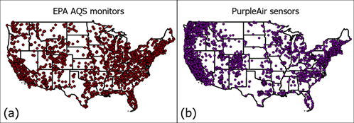
Sociospatial distribution of PurpleAir sensors in Maryland
Project description: Using Python scripting and GIS packages, maps were developed to find the differences in where someone lives and where their nearest air quality sensor is.
1. Why is this important?
Underserved communities across the country are often overlooked by the EPA’s AQS monitoring network, usually based on economic, political, and social motivations. Since the likelihood of living nearer to industry and manufacturing falls disproportionately on marginalized communities, the lack of information about hyperlocal air quality in these areas can be deadly.
Brands like PurpleAir and IQAir offer a simple, all-in-one package to track various air quality metrics such as PM2.5, ground-level ozone, and oxides, while modular, open-source kits exist for the more tech-savvy built on platforms such as Arduino and Raspberry Pi. Many of these options can be configured to output AQI, depending on the types of data collected. These sensors cost between $100 and $5,000 depending on the options selected. Though this is orders of magnitude less expensive than the regulation-grade monitors, these prices are still prohibitive to lower-income households.
2. How did we do this?
Python was used to pull the location of PurpleAir sensors for Maryland and surrounding states. A k-dimensional search tree was used to locate the nearest PurpleAir sensor to each census tract in the area, and then the difference in median household income (MHI) and percentage of BIPOC residents was calculated for each tract and the tract in which its nearest sensor was located.
3. What did we see?
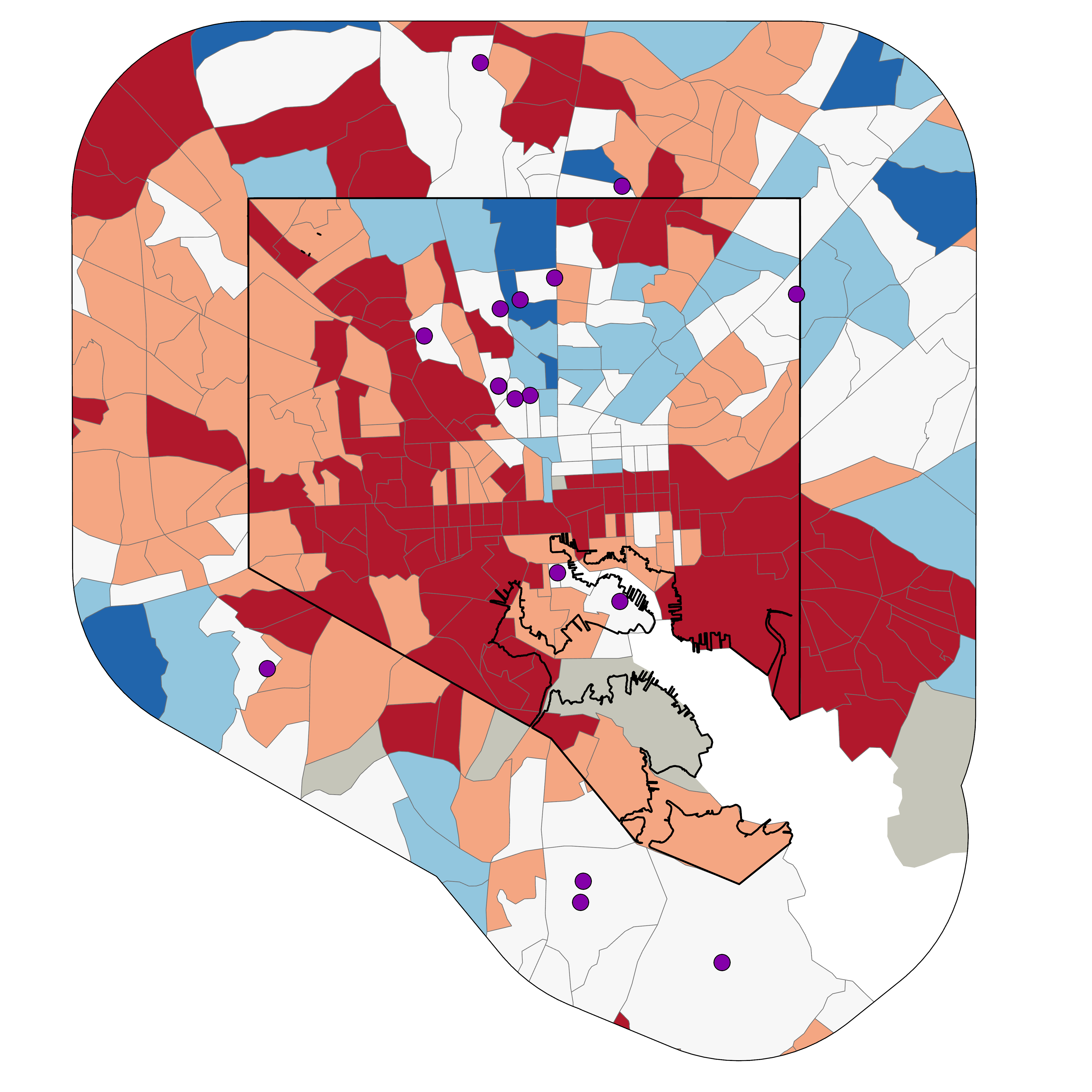
Tracts seen in red are those with a lower MHI than the closest PurpleAir sensor to their location. Blue tracts have a higher MHI than their closest sensor location.
4. How can we use this?
This map clearly demonstrates Baltimore’s White L, a historically prevalent trend evolved from the redlining days of the early 30s. This data, when expanded to the national level, can be used to demonstrate locations with high population density (like Baltimore) that are underrepresented by local air quality sensing solutions.